A new sentence
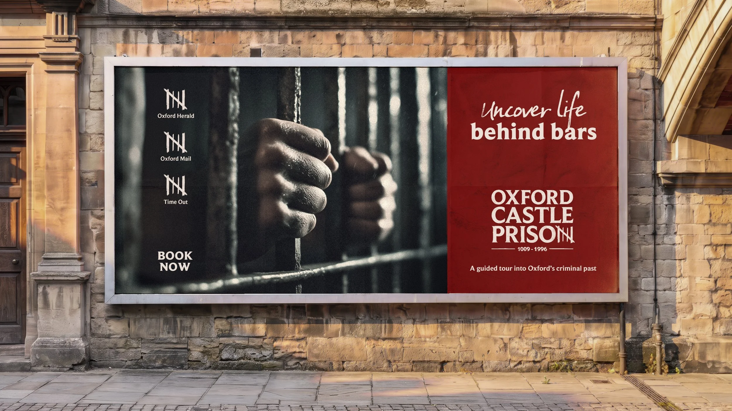
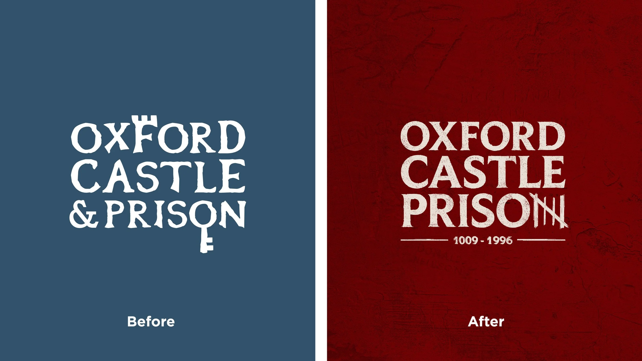
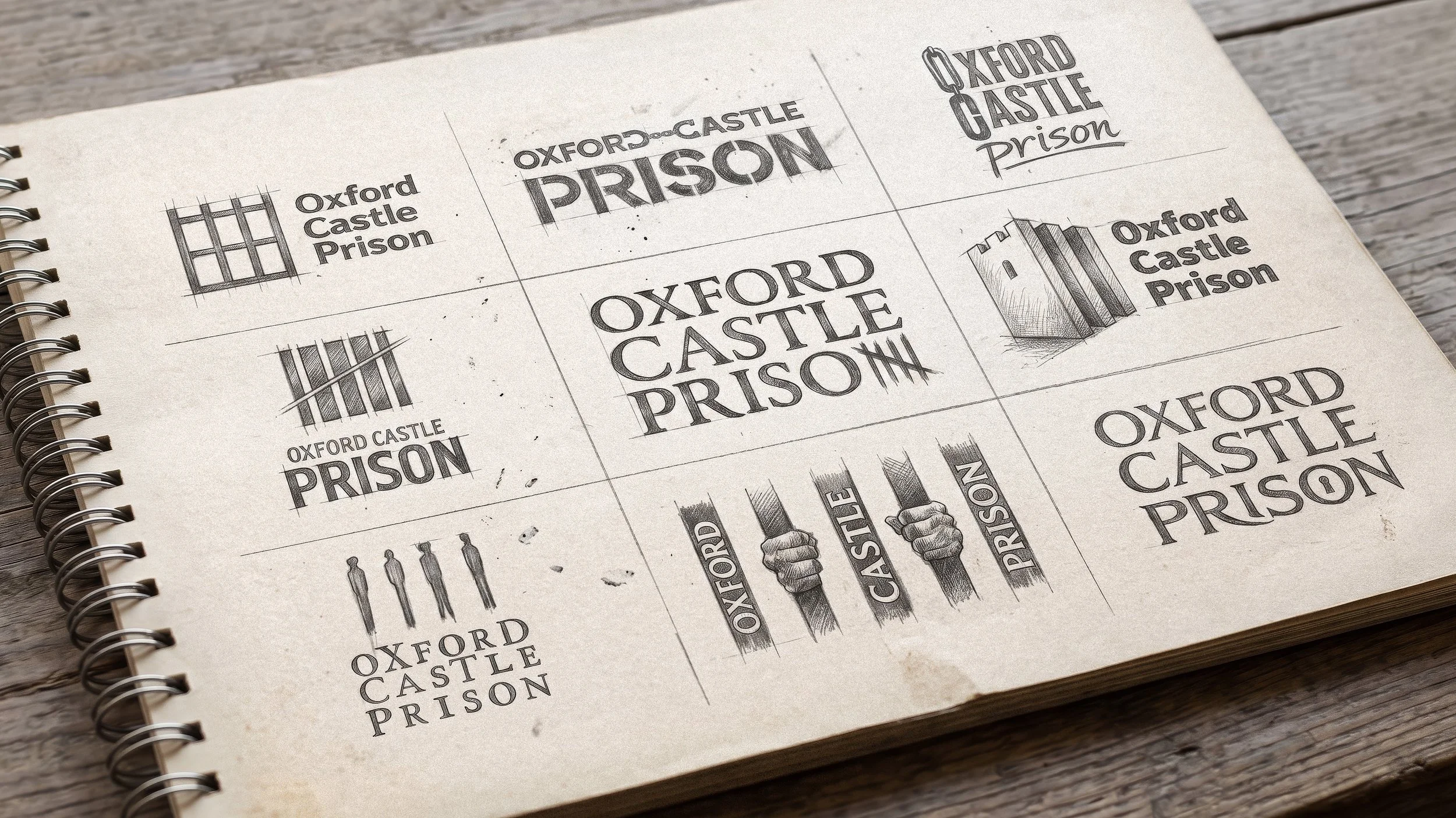
Continuum Attractions approached LMC to rebrand Oxford Castle Prison to coincide with their repositioning of the attraction to focus more on the prison’s history than the castle. We relished the challenge of creating a brand that felt distinctive, authentic and rooted in its history. The concept phase produced a number of clever routes, but the idea that resonated with the client replaced the N in ‘Prison’ with a traditional prison tally mark – referencing the prison walls, the passage of time and the personal experiences of the inmates who once lived there.
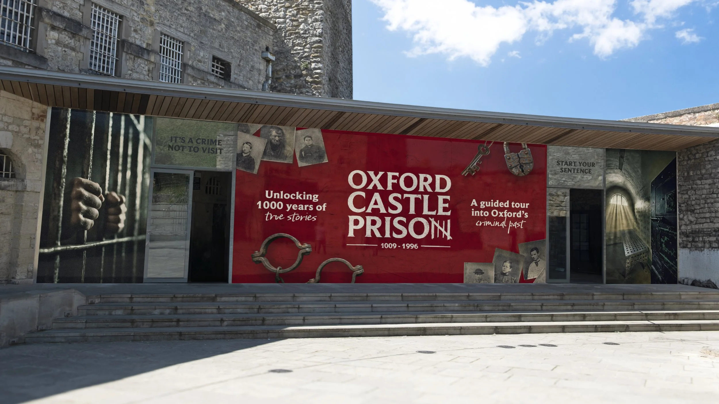
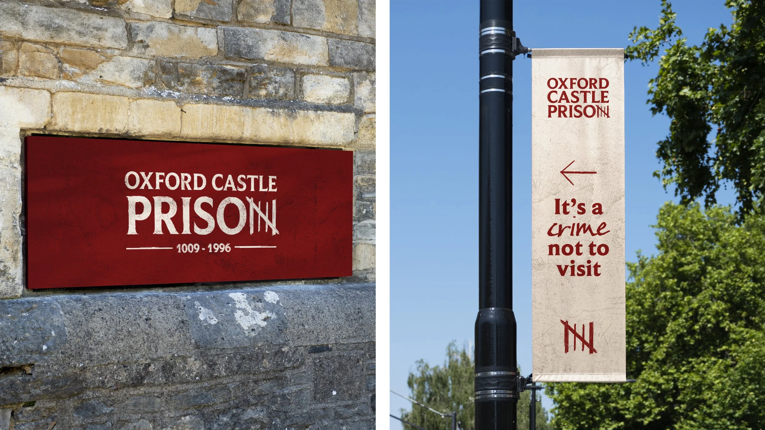
Time well spent
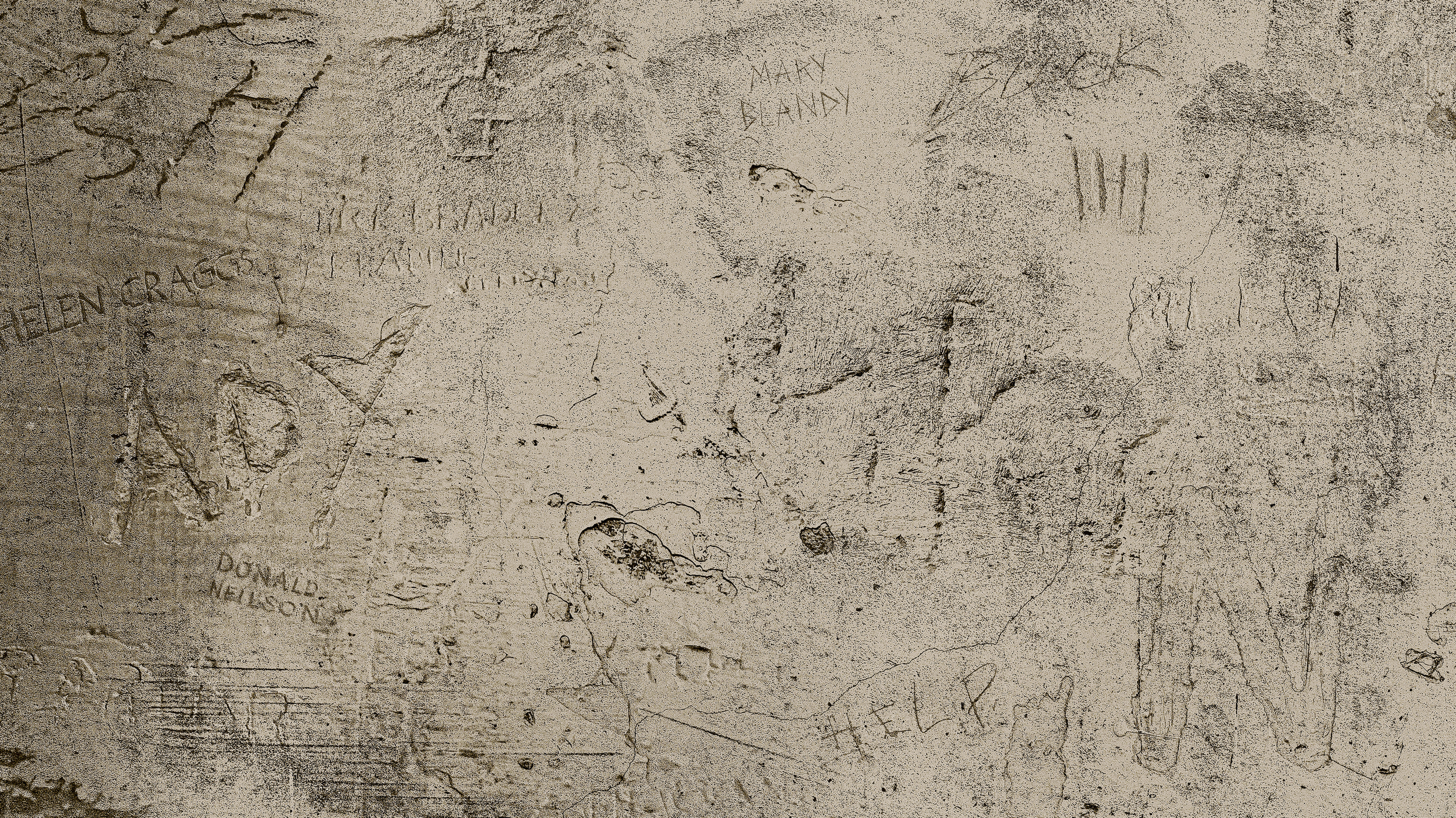
As well as the logo, we developed a playfully punny tone of voice, a suite of gritty imagery, distinctive colour palettes and typefaces, and a unique background pattern. This combines markings, carvings, signatures and graffiti found on the walls of Oxford Castle Prison into a single, distinctive design.

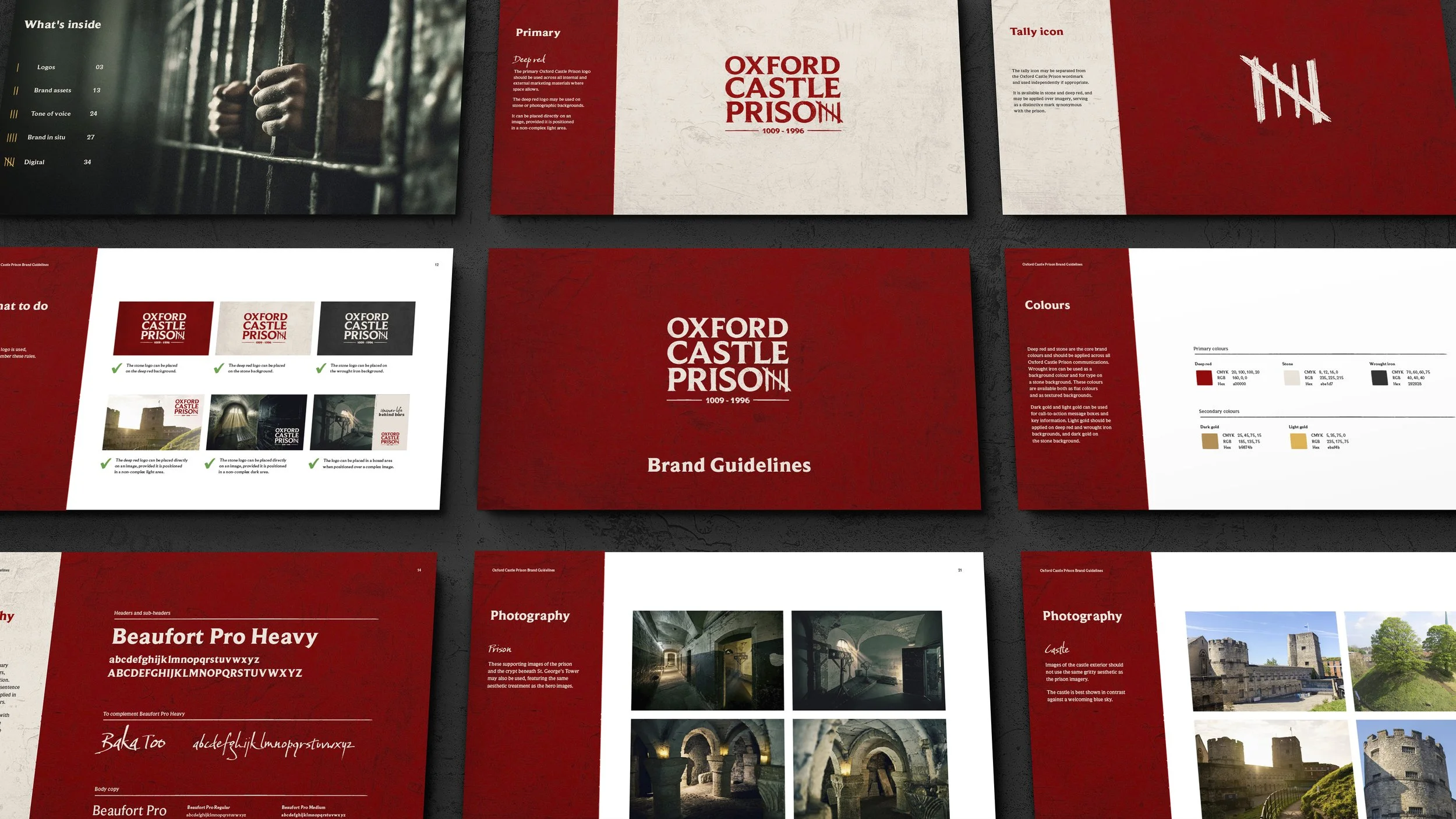
Breaking out
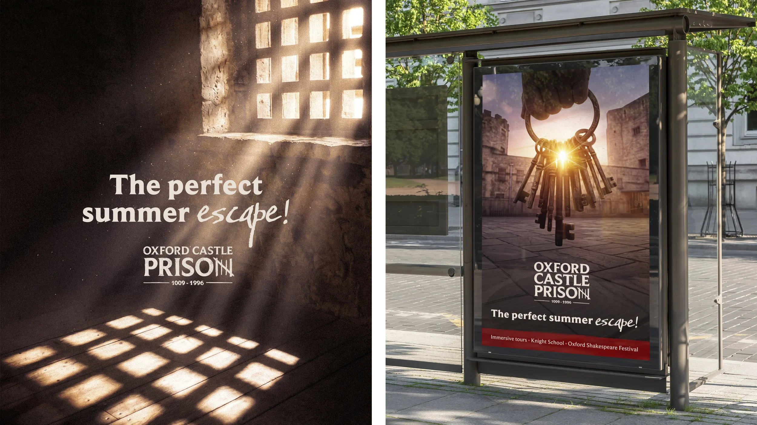
For out-of-home, all the brand elements come together. The tally symbol cleverly doubles as a review score, creating a distinctive way to showcase visitor and press feedback. A summer campaign centred around the headline ‘A Perfect Summer Escape’ cleverly plays on the language of holidays, while also nodding to a prison escape.